At a Glance
This responsive project includes redesigns of every main page and feature on Fishersci.com, including the homepage, product category and detail pages, global navigation, search, catalog taxonomy and metadata, transaction and account pages, marketing pages, and more. Due to the size and complexity of this project, I did quite a bit of usability testing. This project also entailed a CMS replatforming and huge content migration.
What I did
- UX Analysis
- Content Strategy
- Information Architecture
- Prototyping
- Usabilty Testing
Client's Industry
- Life Science
- Marketing
- E-commerce
Type of Project
- Website Redesign
- CMS & PIM
Fishersci.com Profile
Fisher Scientific’s B2B e-commerce site, which sells chemicals, equipment and other life science products to university, biotechnology, pharmaceutical, hospital, and industrial testing laboratories.
- Revenue/Year: $2 billion (2014)
- Number of Products: 1,800,000
- Number of Product Categories: over 6500
- Key Customers: Laboratory scientists
- Total visits/month: 1.3 billion
- Unique site visits/month: 600,000
It’s science! A data-driven approach to designing Fishersci.com’s new e-commerce navigation
Fishersci.com had a problem common to many B2B e-commerce sites – customers’ were having problems finding what they wanted among their 1.8 million products.
David Ginsburgh, a Laboratory Manager at a small biotechnology company summed it up well: “If I know what I’m looking for, the search engine works well. But if I only have an approximate idea, I get too many hits and it’s hard to narrow down, or I get funneled to an unexpected location and get lost.”
In fact, many customers found the site’s search and browse experience so frustrating they used it as little as possible – and instead resorted to leafing through Fisher’s 2,500 page print catalog, which lists only 10% of the products on the website and is only published every few years. When customers needed to make a purchase online, many first located the product in the print catalog, then typed the part number they wanted to order into the website’s search field.
Identifying Fishersci.com’s core findability issues
The first law of e-commerce design states: “if customers can’t find your products, customers can’t buy your products.” In other words, findability issues are not just usability problems, they’re profitability problems. Clearly, identifying Fishersci.com’s core findability issues was vital to the success of their redesign.
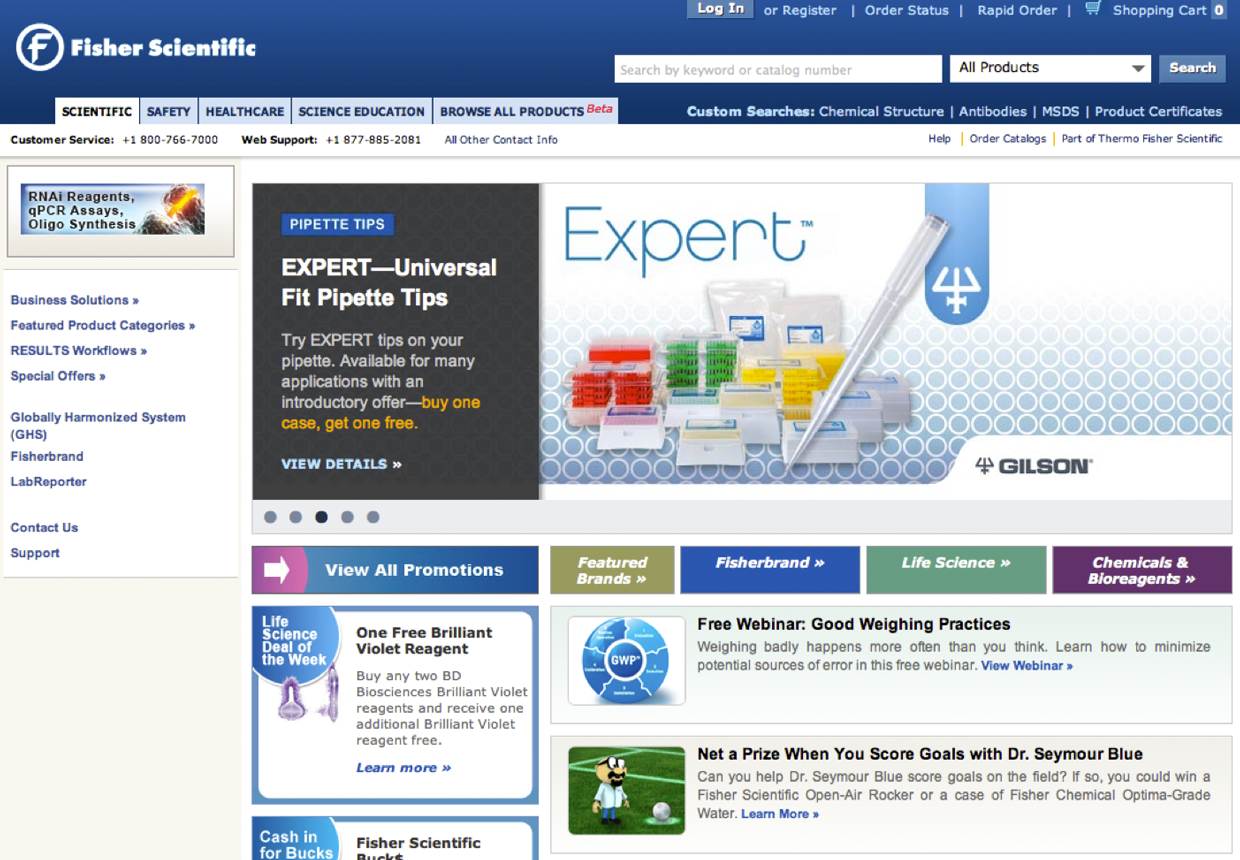
Old Fisersci.com Homepage and Global Navigation
Customers were very confused by Fishersci.com's market-based global navigation. They wanted to shop for products, not markets!
After analyzing key metrics, performing a content inventory and audit, interviewing stakeholders and customers, and completing a competitive review and heuristic UX analysis of their site, we identified several problems that were making browsing and searching for products a challenge:
Information Architecture
- Fishersci.com’s global navigation was based on internal marketing divisions, not product areas.
- 80% of the site’s global navigation real estate was dedicated to marketing content, not e-commerce navigation (See Figure 1).
- There were no flyouts in the global navigation to enable customers to drill deeper into the site.
- Catalog taxonomy and structure was too company focused.
- After searching or browsing, customers were overwhelmed with long product listings and long lists of facets.
Content Strategy
- Products often lacked images or had such poor descriptions that customers had difficulty confirming they found the right product.
- Marketing content was in a completely different section of the site than e-commerce – so most customers missed seeing this information while shopping.
Filtering Search Results
- On search results pages, customers were often overwhelmed with product filtering options, because there were no rules governing which filters should be shown or hidden at different stages in the search/browse experience. Instead, their site showed all possible filters all the time.
Governance
- Lack of centralized web team with a holistic view of the site to set and enforce standards for functionality, design, content, and information architecture.
Fixing Fishersci.com's navigation and catalog browse experience
The foundation of any e-commerce site is its catalog structure and taxonomy – it’s the architecture upon which site navigation, search, SEO and product and marketing content is built. Thus, before we could address any of Fishersci.com’s other findabilty problems, we needed to fix its taxonomy and navigation.
Step 1: Listen to Fishersci.com's customers
The first step in designing Fishersci.com’s new navigation was to find out how their customers would organize the catalog if it were up to them: what products would they group together and what would they call these groups?
To answer such questions, we did a remote open card sorting exercise with 57 customers. The results indicated that Fisher Scientific customers strongly prefered to categorize products by product type (e.g., Centrifuge, Chemical) rather than by market, brand, or what type of experiment the product is used in.
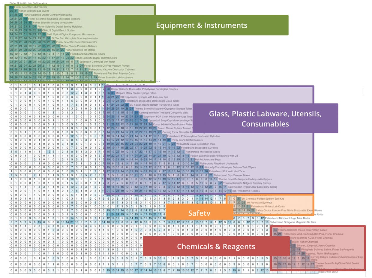
Card Sorting Similarity Plot
Cusotmers clearly preferred to categorize products by type rather than market area.
Step 2: Develop and test the new site navigation
Using the card sorting results and site metrics (including traffic, internal and external keyword search logs) and other inputs (best practices, stakeholder interviews, etc.), we developed 3 different catalog hierarchies of increasing levels of “flatness” – with 7, 18, and 34 top-level categories. The goal was to identify the proper breadth and depth of the catalog taxonomy and test how intuitive the groupings and labeling were to customers.
Using the tree testing software, we created clickable versions (see Figure 3) of the 3 draft hierarchies as well as Fishersci.com’s current catalog navigation (to use as a baseline control). The tree testing software tracked customers’ success rate, how direct their success was (did they have to backtrack a lot, and if so, where did they take a wrong turn?) and the time it took them to complete each task. Based on these metrics, we obtained a very accurate picture of what was working and not working in our proposed hierarchies.
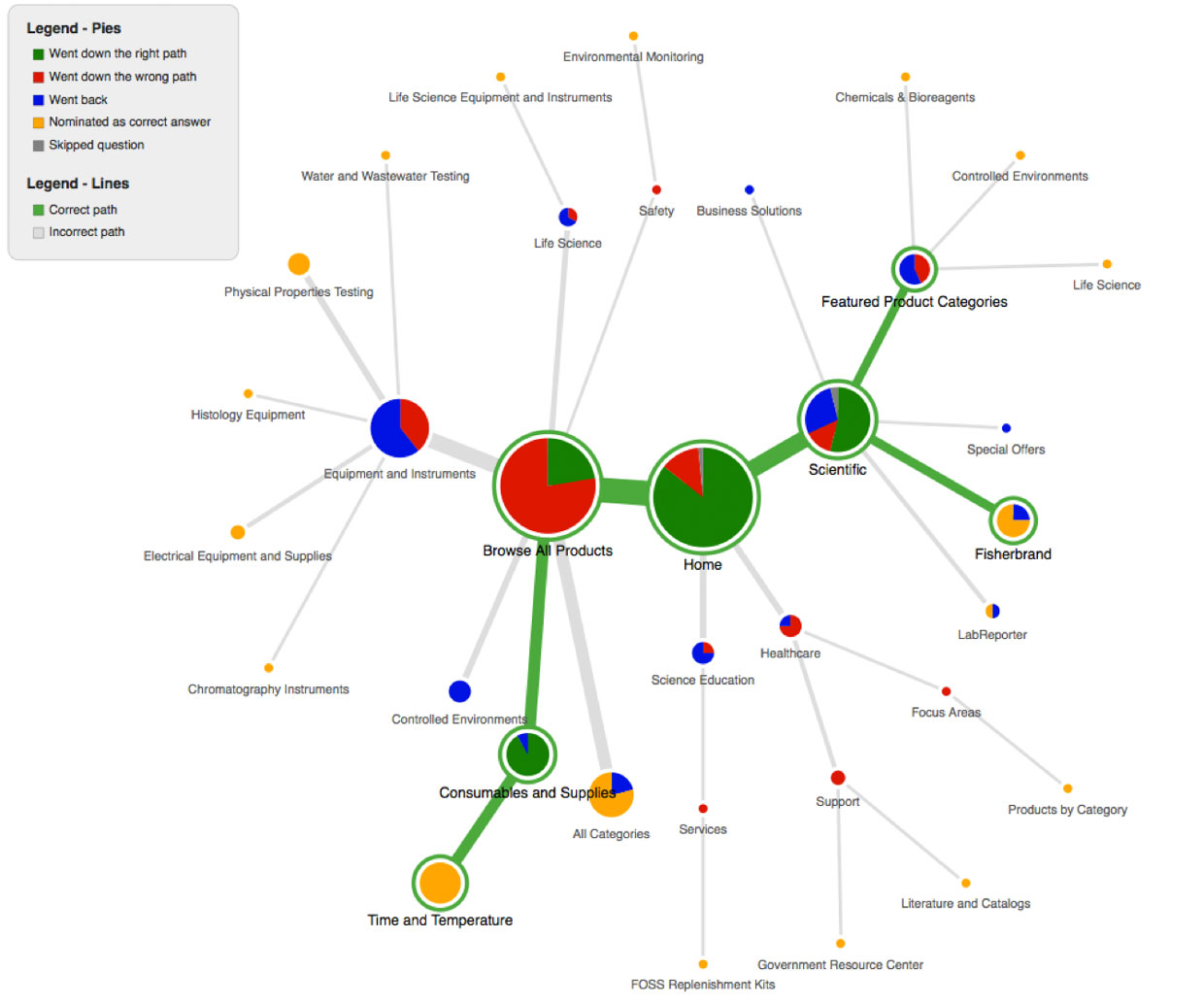
Results from Tree Testing of Fishersci.com's Old Site Navigation
What tree testing data looks like for a poorly designed hierarchy. This plot indicates that most customers were unable to find the correct location of this product, and instead went down many unsuccessful navigational dead ends.
And the winner is...
To our surprise, the tree testing results clearly indicated that the flatter the hierarchy was, the faster and more accurately customers were able to find products. Customers were able to find products faster and more directly using the 34-category hierarchy than with the 18-category one, which in turn was easier for cusotmers to use than the 7-category hierarchy.
We were worried that the flattest hierarhcy contained too many categories to work well in reality, so we built working homepage prototypes using the 18- and 34-category taxonomies and tested these with customers in moderated in-person sessions.
During prototype testing, most customers thought the 34-category navigation menu was too long, and many had trouble scrolling down to the bottom of the menu, which extended below the fold in the desktop view. As a result of this testing, Fishersci.com decided on a middle-length option with 20 product categories in their global navigation menu.
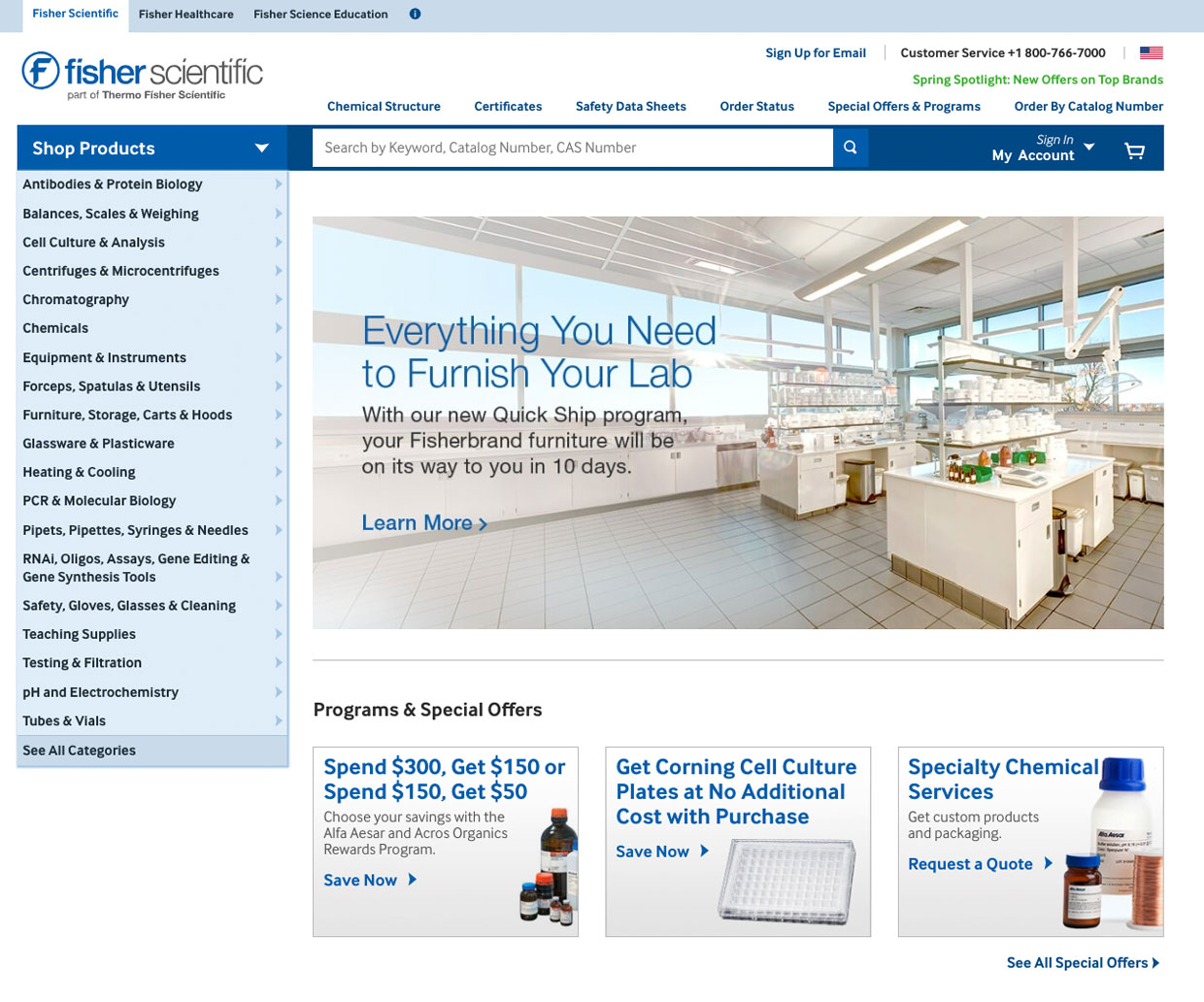
Fishersc.com's new 20-category global navigation
Even though this design is now 4 years old, Fishersci.com is still using it almost exactly as we designed it!
Summary of Navigation Improvements
- Designed new catalog taxonomy based on product categories, not market areas or internal business units.
- Used customer-centric labeling and groupings based on card sorting results and most popular search keywords, and vetted labeling and structure using tree testing.
- Increased number of top-level categories, to make the hierarchy flatter and the labeling more specific, thereby increasing discoverability and SEO value.
- Used a vertical menu with flyouts to increase visibility of menu and accessibility of sub-categories.
McGladrey
Website Redesign of the 5th largest accounting firm in the US (now called RSM International).
Next Project