A guide for creating a better retina web
Preparing the web for a new era of displays.
It’s been almost one year since Apple released the Retina MacBook Pro, the first device produced for the masses that is not a mobile phone or tablet and offers a screen with an incredibly high pixel density. While almost all major apps for OS X have been updated already to appear in a super crisp look, the web still isn’t retina ready at all. Most web designers and developers out there still produce low-resolution content for the web – which is a bad thing, because retina actually matters.
Because high-resolution displays are the future. Almost all up-to-date mobile phones and tablets on the market have one and desktop products are now following this trend. I’m sure we will see a lot of new devices with retina displays in the next two years. When launching a new web product these days you should totally optimize it for retina screens since more and more people will be able to enjoy your awesome sharp pixels and less people will be annoyed by your incredibly blurry interface, which caused eye infections before you optimized for retina.
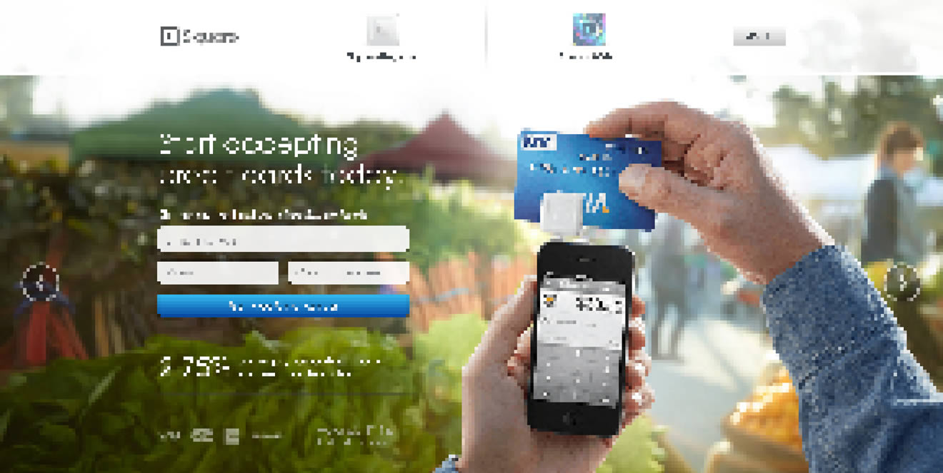
Most people I’ve spoken with about this issue didn’t really understand why optimizing actually matters. Here is a screenshot of a start-up’s website which looks great but isn't optimized for retina:

– can you see these pixels? Ugh. I'm sorry about this stupid joke. Square, you rock, but you should really take retina serious.
Modern browsers support retina screens and are able to serve different assets depending on the device screen density. Basically, you need to know that everything except images are rendered in retina resolution automatically. If your site relies heavily on CSS effects such as gradients, box-shadows, and borders you don’t need to optimize too much at all, apart from the images.
If you are using bitmap graphics as background images, you should create versions of these images that have double the resolution of the original image. By using CSS media queries you can serve these high–resolution images automatically to retina devices.
We have two images, one for normal display and one for high-definition displays. I recommend using the same file name for both, but adding “@2x” at the end for the retina assets (known from iOS development).

By adding a CSS media query that detects high-definition displays you can change the image path of the original background-image to the @2x image for those displays. Adding the background size property is important since it will tell the browser the dimensions of the original image (the size the image will actually appear).
/*CSS for basic styling and non-retina image path:*/
.icon{
  width: 100px;
  height: 100px;
  background-image: url(icon.png);
}

/*CSS for serving the retina image to devices with a high "device-pixel-ratio":*/
@media only screen and (-moz-min-device-pixel-ratio: 1.5),
only screen and (-o-min-device-pixel-ratio: 3/2),
only screen and (-webkit-min-device-pixel-ratio: 1.5),
only screen and (min-devicepixel-ratio: 1.5),
only screen and (min-resolution: 1.5dppx) {
  .icon{
    background-image: url(icon@2x.png);
    background-size: 100px 100px;
  }
}
There is a different technique coming (already implemented in current webkit browsers), called image-sets. With this new CSS feature you won‘t need CSS media queries to overwrite your image path, you can simply serve two different assets and the browser will automatically decide which to download. However, since this is currently only working in webkit browsers I do not recommend using this in production yet.
.icon{
  width: 100px;
  height: 100px;
  background-image: -webkit-image-set( url(icon.png) 1x, url(icon@2x.png) 2x);
}
SVG is seriously awesome. As long as your graphics do not contain too many crazy filters and effects that you have stitched together in Photoshop, the chances that you can export your graphics to svg are high (note: does only work for vector graphics, not photos). You should take it even further and create a SVG sprite which contains all your graphics to reduce the amount of http requests. Just use these sprite graphics as you are used to. The amazing part of this technique is that there is absolutely nothing more required to make your graphics look sharp on retina displays.
.icon{
  width: 100px;
  height: 100px;
  background: url(svgSprite.svg) 0 -200px no-repeat;
}
– if you are not on a retina device, zoom in to see what's great about SVGs. They are always sharp.
Unfortunately in the current version of Firefox (19, while I’m writing this), the browser doesn‘t renders SVG sprites in retina resolution – only single image SVG‘s. Hopefully Mozilla will fix this soon. Opera has some serious bugs when it comes to SVG sprites – these will probably be fixed automatically since they are switching to the webkit engine soon.
Serving high-resolution assets for <img> tags works a bit differently. Since the image path isn’t set in the CSS but in HTML you can’t use media queries. Again, there are different approaches to serve sharp images to users with a retina device.
By adding an @2x image by default and resizing it to the original size you are serving the same asset to non-retina and retina devices. This isn’t optimal since the file size of @2x assets is actually a lot bigger than for normal-resolution ones. This means non-retina users are unnecessarily loading the large file, however in some cases it might not matter that much because you are not loading a lot of images or the images are pretty small.
<!-- The image itself is 640x240px. Scaling is done into HTML. -->
<img src="photo.jpg" width="320" height="120">
– Note: you might only notice a difference between these two photos if you are viewing them on a retina ready device.
Pro Tip: use jpgs when possible and use a higher compression rate than you would do normally. The guys at Netvlies have proven that in some cases you can have a smaller file size and better quality.
Retina.js is another easy way to serve high-resolution assets to retina devices. The pro is that you’re no longer serving big files to non-retina devices. The con is that with retina.js you are serving normal-sized and @2x images to retina devices, which dramatically increases the loading time of your site. In addition, if there is no @2x version of the image available the script will cause a 404 error which is never really nice. The script has a few issues with svg graphics as well – when using a svg image in the src of your <img> it will look for a @2x version which is of course not available since it is not required. I cannot recommend using retina.js if you care about a fast loading time and an empty error console.

– in this example, the missing @2x assets are causing 404 errors.

– when the script is working as expected, retina devices will request the normal sized image first and after downloading the @2x version as well. This means doubled requests and a longer page loading time.
“Retina Images” is a pretty nice solution to serve high-resolution images automatically without double loading resources. It relies on javascript, enabled cookies, PHP, and a modified .htaccess file – if this isn’t a big problem for you it’s probably the best solution to offer your visitors the full retina experience. In case an @2x image isn’t available it will just revert back to the normal sized image. If you are using Wordpress, there is also a plugin available which makes the installation even easier.
In the last year, icon fonts were hyped pretty hard. Of course, they are a pretty useful way to include glyph icons in your website which can be scaled endlessly, and they are easy to modify by applying CSS. Since it’s a font these icons are retina optimized by default. Still, I can’t recommend using icon fonts when you care about pixel perfection. Almost every browser out there renders fonts in a different way than others, which makes it impossible to optimize icon fonts. Especially on non-retina screens you will often see blurry lines (known as half pixels) and due to different anti-aliasing settings on OSX and Windows, lines might look really bold on one system and thin on another one.

Instead use SVGs – they will appear as you’ve exported them and will not be harmed by browser or OS settings.
Favicons might be a small part of a website but they are also the part that represents a website link in bookmark bars, news readers, when pinned to a Windows task bar, and on “most visited” tabs in browsers. A blurry favicon next to high-resolution favicons in a bookmark bar will look pretty out of place on a retina display (Twitter and Quora users will know).
I can highly recommend x-icon editor for creating retina-ready favicons in .ico file format. Just upload one 64 x 64 sized image and you can export an .ico file which also includes downsized versions of your uploaded icon. If you need to fine-tune each of the four included icons (64, 32, 24, 16 pixels) you can also upload a single icon for each size separately.

Also, don’t forget to provide Apple touch icons which will be displayed when a website is added to the iPhone/iPad home screen.

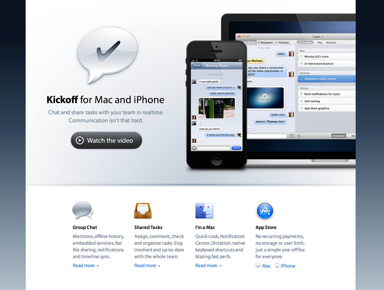
– Kickoff App Website, absolutely great - except the non-retina favicon.

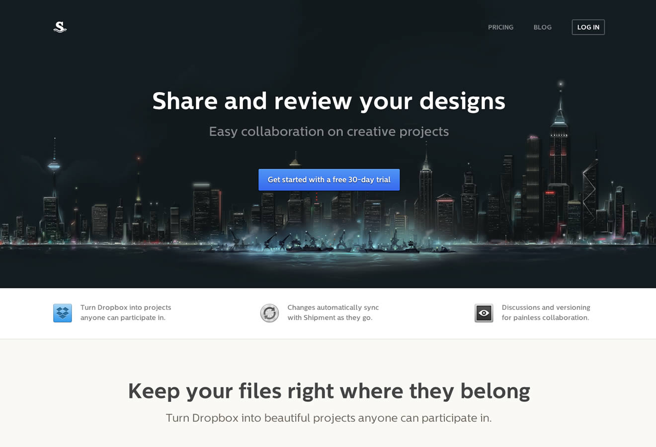
– Shipment App Website, great experience but a few non-retina elements into the footer.

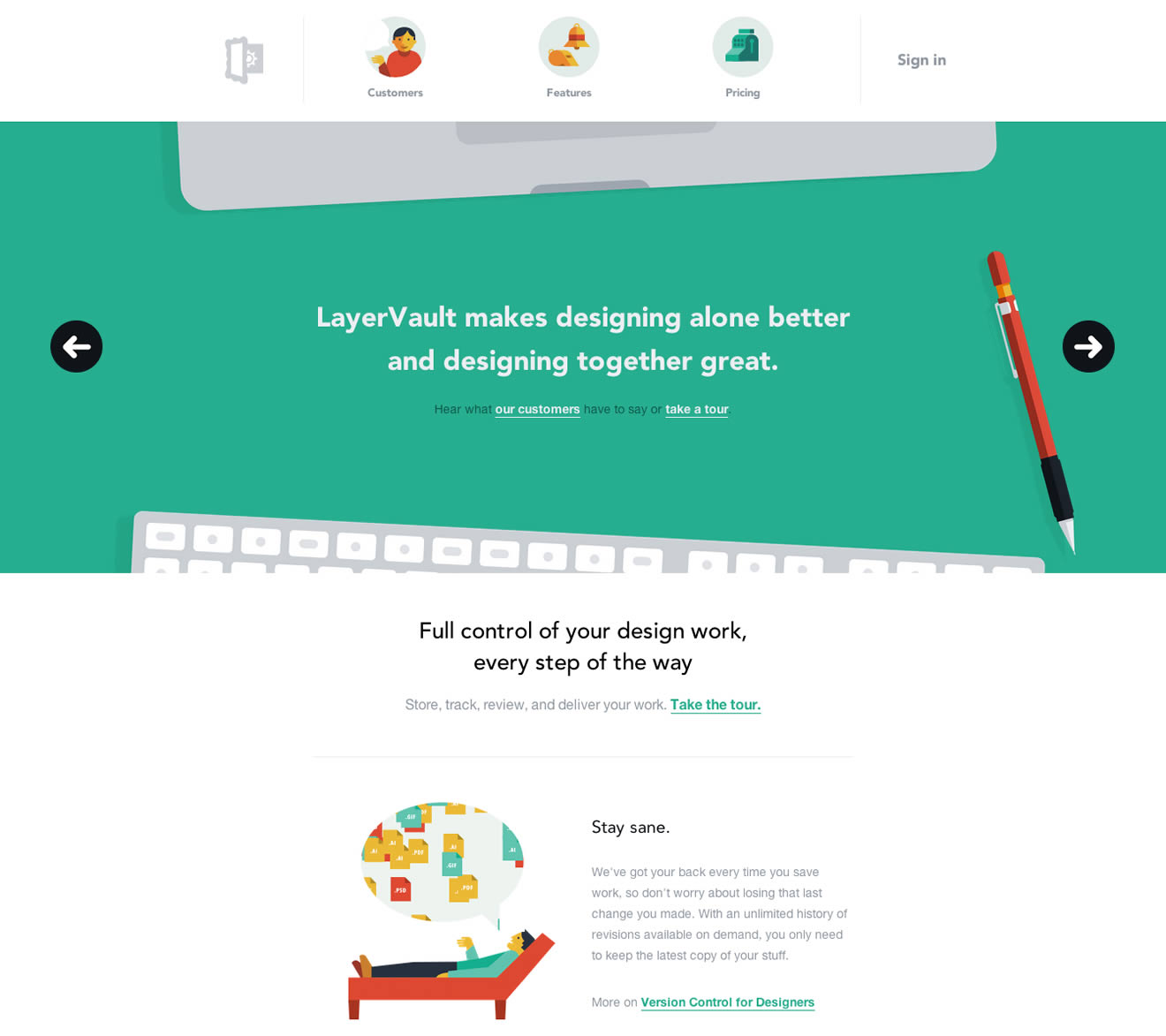
– LayerVault Website, perfectly retina optimized - great example for using SVGs to achieve retina optimization.
I hope this little guide helps designers and developers out there to produce better retina content. If you have any questions or know some other tricks to create a better retina web, please let me know in the comments!