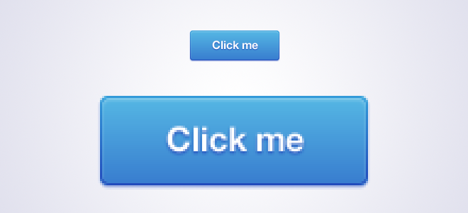
I‘m starting a small tutorial series on my blog entitled “Going crazy with CSS3“. In each issue, I will describe a technique to achieve some special effects with CSS3. I‘m not trying to show you basic tutorials, but only techniques for edge cases, which are really helpful when you want to take your user interface to the next level. In the first Issue, I will cover a simple technique: how to create a CSS3 button with a linear gradient border.
Analyze the design
First of all, you need to analyze every pixel of your design, which becomes easier if you built it on your own and you already know which styles you used to achieve the final effects. Zoom in at 400% or more and take care of the smallest details.

For this tutorial, I‘ve built a basic button with a linear background, a border and a few drop shadows. In general, this should be pretty easy to transform into a working CSS3 button, but the gradient background on the border might become a bit tricky since we can‘t apply CSS gradients as backgrounds for borders; but to achieve a really great-looking button, we don‘t want to use a solid color for the border.
The technique
Instead of using a border, we will place an additional span within the button; this way, we can apply a linear background to the button itself (that‘s the border) and another linear background to the inner span (which will be the button’s background). The width of the border can be defined by the amount of padding we add to the outer element.
Make sure you apply box shadows outside of the button to the outer element (a) as well as inset box shadows to the inner element (span).
The code
HTML
<a class="blueButton">
  <span>Click me</span>
</a>
Even if you are using additional markup for creating optical effects that might not be optimal, I think it's okay as long as you don't exaggerate with it.
LESS
I‘m using LESS in this example. If you are interested in the compiled CSS, feel free to download the full package at the end of this post. In addition, I will not use any vendor prefixes in this example, but you should keep in mind that you will still need them if you want to make the button work in older versions of current browsers.
.blueButton{
  background: linear-gradient(to bottom, #339ad9 0%,#224bbc 100%);
  padding: 1px;
  display: inline-block;
  border-radius: 4px;
  box-shadow: 0 1px 1px rgba(34,75,188,0.5);

  span{
    background: linear-gradient(to bottom, #52b1e2 0%,#397fd0 100%);
    font-family: "Helvetica Neue", sans-serif;
    font-size: 16px;
    font-weight: bold;
    color: #FFF;
    text-shadow: 0 1px 1px #224BBC;
    padding: 10px 35px;
    display: inline-block;
    border-radius: 3px;
    box-shadow: 0 1px 1px rgba(255,255,255,0.3) inset;
  }

  &:hover{
    background: linear-gradient(to bottom, #37aff4 0%,#2764ca 100%);

    span{
      background: linear-gradient(to bottom, #59c2f5 0%,#4292da 100%);
    }
  }

  &:active{
    background: linear-gradient(to bottom, #193a7b 0%,#286ab8 100%);
    box-shadow: 0 1px 1px #FFF;

    span{
      background: linear-gradient(to bottom, #3476c6 0%,#489ed9 100%);
      box-shadow: 0 1px 3px rgba(0,0,0,0.25) inset;
    }
  }
}
The result
By adding a little bit extra markup, we are able to create a dynamic width/height button with a linear gradient border. By adding a few box shadows, we can bring some depth into our design and can create a nice-looking 3D button. Side note: always remember to include :hover and :active states for your buttons.