Going crazy with CSS3 Issue 2 - Creating inputs with perfect borders & shadows
Abusing box-shadow for great effects.
In the second issue of this little CSS series, I want to show you how to create perfect inputs by using a lot of box shadows. Even if the input has an optical border, we won‘t use the border property here to achieve some nicer aesthetics.
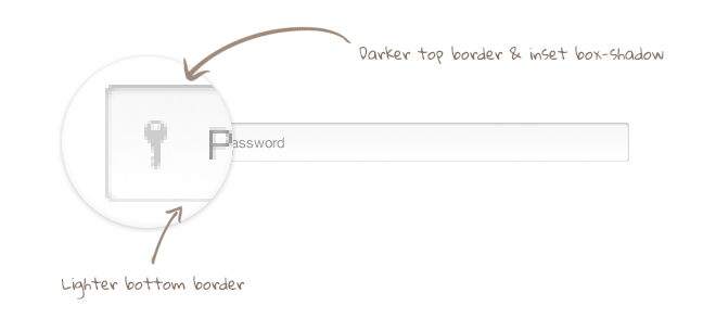
This input field has a linear gradient as background, a border, rounded corners and an inset box shadow.

When taking a look at the zoomed-in screenshot, you will quickly recognize that the upper border is a little bit darker than the bottom border. Also, the left and right borders are slightly darker than the bottom one.

If this input didn’t have rounded corners, we could easily achieve this effect by setting up three different border colors, but unfortunately, if you are using border-radius, the effect won‘t look perfect in the corners because the border colors wouldn‘t fade into each other, which causes a hard color stop in each corner.
We can achieve the desired effect by not using any borders, but multiple box shadows instead. Keep in mind that this trick only works in modern browsers; if you need to support the older ones, you better use borders.
We will use one inset box shadow without blur for each direction, building the initial border. In addition, we will make use of another inset box shadow with 3px of blur for the upper part. The blurred box shadow overlays the other box shadows, making them optically darker and generating a nice-looking inset 3D effect.
Important: If you want to apply a transition to your input, you need to make use of the same technique for the :focus state. Otherwise, the transition between changing box shadows and displaying a border will look pretty strange.
<input type="password" placeholder="Password">I‘m using LESS in this example. If you are interested in the compiled CSS, feel free to download the full package at the end of this post. In addition, I will not use any vendor prefixes in this example, but you should keep in mind that you will still need them if you want to make the button work in older versions of current browsers.
input[type=password]{
  background: url(../img/keyIcon.png) 12px 11px no-repeat, linear-gradient(to bottom, #f7f7f8 0%,#ffffff 100%);
  border-radius: 3px;
  border: none;
  box-shadow: 0 1px 2px rgba(0,0,0,0.2) inset, 0 -1px 0 rgba(0,0,0,0.05) inset;
  transition: all 0.2s linear;
  font-family: "Helvetica Neue", sans-serif;
  font-size: 13px;
  color: #222222;
  position: relative;
  height: 36px;
  width: 300px;
  padding-left: 30px;

  &::-webkit-input-placeholder {
    color: #999999;
  }

  &:-moz-placeholder {
    color: #999999;
  }

  &:focus{
    box-shadow: 0 1px 0 #2392F3 inset, 0 -1px 0 #2392F3 inset, 1px 0 0 #2392F3 inset, -1px 0 0 #2392F3 inset, 0 0 4px rgba(35,146,243,0.5);
    outline: none;
    background: url(../img/keyIcon.png) 12px 11px no-repeat, #FFF;
  }
}By using this technique, we are able to create wonderful CSS3 input fields, which also look really nice on retina displays (if you want to use an additional icon, like in my example, make sure you provide a high resolution for retina displays as well).