How to achieve pixel perfection in your designs with Adobe Fireworks
For those who care about real perfection.
When it comes to user interface design, Adobe Fireworks is an excellent tool for laying out your ideas and also for creating cutting edge graphics for your App/Website. Like in any other graphic software, there are different ways to create one effect. However, the result doesn‘t always look the same for each method. In this article, I want to show you how to achieve real pixel perfection in your designs.
When you have an object in your design that you want to emphasize for some reason, making it shine is a great way of grabbing the attention of your users, and also of keeping the interface eye-catchy. In Adobe Fireworks, there are three main ways how to create a glow/shadow, but the result is also different for each method.

This is the standard glow effect provided by Fireworks. The effect can be added to any object via adding the Filter, “Glow“.
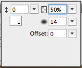
In this example I’ve used a glow distance of 0 pixels and an opacity of 50% while I’ve set the blur to 14px. This should generate a wide glow without any distance to the light source.

- a simple glow effect using Fireworks glow filter.
The problems can be seen in the image above; if you use this effect for a decent (around 0-30% opacity) glow, the glow won‘t be totally smooth and you can detect the corners in the glow – something that should never happen. The glow filter can be easily used for hard glows or glows with a very small blur (max. 6px), but you should avoid using this filter for a big glow with a low opacity.

Since Fireworks allows you to use Photoshop Layerstyles, you can also create a glow via the Photoshop-Live effect, “Outer Glow“.
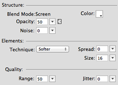
The Photoshop-Live Effect offers a few more attributes then the Fireworks glow effect. In this example I’ve tried to achieve the same result like generated by the Fireworks effect.

- simple glow effect achieved with the Photoshop-Live effect, “Outer Glow“.
The PS-Live effect works very similar to the Fireworks filter. The main difference between the Fireworks filter and the PS-Live effect is the blend mode of the applied glow. The PS-Live effect uses negative multiply as its default blend mode, which cannot be changed, while the Fireworks filter uses the normal blend mode as its default. The difference is minimal and, personally, I don‘t see any difference. The problem remains the same; you can also see the corners of the glow.

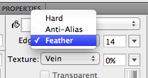
This method requires a second shape, which is slightly bigger than the shape you want to apply the glow to. It should have the same attributes, like your original shape (e.g. color, other effects), and you have to place it behind the original shape. When you change the edge-mode to “Feather“ for this shape, you can achieve a very smooth glow effect.

- the result we want – a very smooth glow without any visible corners.
Since this method generates the smoothest result, I recommend always using this way for decent and extremely wide glows. You can only use this effect if you‘re working 100% with vector shapes. If you want to use this method for text, you have to convert your text to a path first, because text doesn‘t let you change the edge-mode.
Another way to generate a glow effect is using the Filter, “Gaussian Blur“. However, it seems like this filter is using the same algorithm to render blur, like the “Glow“ Filter. What this means is that you are confronted with the same problem described above, when choosing to use gaussian blur to create a glow.
Since the Creative Suite 5 update, gradients can be “dithered“. Basically, this means that the colors of the gradient are mixed a little bit on a subpixel level. This results in a very decent grain, which blurs the color gradations.

The Dither tool is a great feature, which allows you to create smooth gradients with a small amount of colors between the different color stops. While this is the main purpose, you shouldn‘t use dither for any gradient. On smaller gradients with enough colors between two stops (which means ideally one color per pixel), there is no need to dither. If dither is used on such gradients, it will interrupt the natural flow of the gradient because the position of the color stops will be manipulated.

While font rendering isn‘t the thing Fireworks does best, you can do a lot with custom anti-aliasing settings, in order to get your text looking right. Of course, there isn‘t one rule you can apply to all your text but if you use standard sans-serif fonts, such as Helvetica, Arial or Verdana, these settings should work effectively:

For serif and script fonts, it can be a bit tricky producing decent results because the little serifs are often rendered too hard or too soft. Just try and find the middleway here, through dragging the sliders of sharpness and strength.
When you create very large headlines (around 56px or larger), for example, for a huge title in a website‘s header, which uses sans-serif or pixel fonts, I recommend to always convert the text into paths. If you can detect some half-transparent misplaced pixel then just use snap to pixel to achieve a sharp, yet smooth and anti-aliased text.

These were just a few tips I wanted to share with the pure pixel fetishists out there; I will share some more via Twitter or maybe on another blog post in the future. Please also let me know what you think about these little details and if you know any more tricks in getting the pixels right.