The iOS 7 Design Cheat Sheet
Everything you need to know when it comes to iOS 7.
The data presented on this Cheat Sheet does not contain the latest updates of iOS 8 and the new Apple devices released mid 2014 (iPhone 6, 6 Plus, iPad Air 2).
View the new version
With the release of iOS 7, app designers and developers will need to adjust their visual language to match the new "flat" design of iOS. In addition to the grid system, the dimensions of icons and commonly used elements, typography and iconography has been updated by Apple in many ways. That‘s why the old iOS Design Cheat Sheet that I published last year with the release of the iPad mini needs an update now. I decided to shift away from pure value-based tables about sizes of design elements towards a simple guide that should help to get you started with iOS 7 app design. As always I will update this guide over time, and if you think there is something important missing here, just let me know.
Since iOS 7 is not supported on older models of the iPhone and iPod (only 4+), this guide will only cover the supported devices. If you are looking for information related to these devices, you should take a look at the older iOS Design Cheat Sheet v2.
| Devices | Portrait | Landscape |
|---|---|---|
| iPhone 5 iPhone 5, 5S, 5C | 640x1136 px | 1136x640 px |
| iPhone 4/4S | 640x960 px | 960x640 px |
| iPhone & iPod Touch 1st, 2nd and 3rd Generation | 320x480 px | 480x320 px |
| Retina iPad iPad 3, iPad 4, iPad Air | 1536x2048 px | 2048x1536 px |
| iPad Mini | 768x1024 px | 1024x768 px |
| iPad Mini Retina | 1536x2048 px | 2048x1536 px |
| iPad 1st and 2nd Generation | 768x1024 px | 1024x768 px |
| Devices | PPI | Color Mode | Color Temperature |
|---|---|---|---|
| iPhone 5 iPhone 5, 5S, 5C | 326 | 8bit RGB | Warm |
| iPhone 4/4S | 326 | 8bit RGB | Cool |
| iPhone & iPod Touch 1st, 2nd and 3rd Generation | 163 | 8bit RGB | Warm |
| Retina iPad iPad 3, iPad 4, iPad Air | 264 | 8bit RGB | Warm |
| iPad Mini | 163 | 8bit RGB | Warm |
| iPad Mini Retina | 326 | 8bit RGB | Warm |
| iPad 1st and 2nd Generation | 132 | 8bit RGB | Warm |
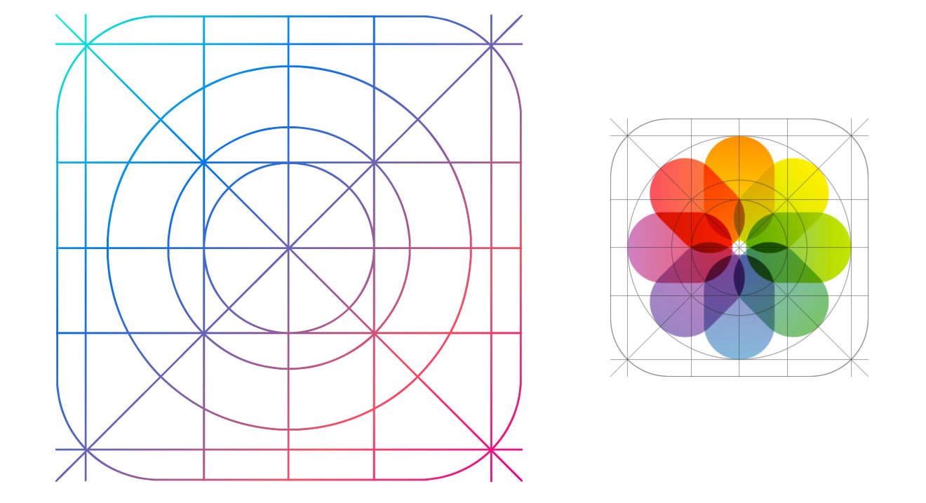
One of the biggest changes in iOS 7 is the new dimensions and the visual language used for app icons. Apple introduced a grid system, increased the general size of icons on your home screen and also masked icons with a different shape.
| Device | App Icon | AppStore Icon | Spotlight Icon | Settings Icon |
|---|---|---|---|---|
| iPhone 5 iPhone 5, 5S, 5C | 120x120 px | 1024x1024 px | 80x80 px | 58x58 px |
| iPhone 4/4S | 120x120 px | 1024x1024 px | 80x80 px | 58x58 px |
| Retina iPad iPad 3, 4, Air, Mini Retina | 152x152 px | 1024x1024 px | 80x80 px | 58x58 px |
| iPad Mini | 76x76 px | 512x512 px | 40x40 px | 29x29 px |
| iPad 1st and 2nd Generation | 76x76 px | 512x512 px | 40x40 px | 29x29 px |

The old simple radii values for rounded corners are gone. Apple introduced a new shape, named "superellipse". Since Apple did not release an official template of the shape, you will have to use one of the unofficial templates out there, which are replicating the shape in more or less accurate ways. The best I‘ve came across so far is the App Icon Template, which is definitely a very good starting point when you‘re designing an app icon for iOS 7. As always, the rounded corners should not be included in your final exported assets - but you might need them while your design process if you want to add effects, such as a stroke or shadows, which are aligned to the corner of the icon.

Apple developed a golden ratio grid system, which can be used to size and align elements on your icon correctly. Anyways, the grid template got criticized a lot by the design community, and it seems like designers (even Apple designers) are not following the grid system very strictly. Feel free to break rules if your icon looks better without taking care of the new grid system.
The biggest change in iOS 7 is definitely the all new flat user interface design language used across the whole operating system. While pretty much all gradients and shadows got removed from UI elements, the sizes of commonly used design elements got changed in some cases as well.
| Device | Height of Status Bar | Height of Navigation Bar | Height of Tab Bar | Width of Tables |
|---|---|---|---|---|
| iPhone 5 iPhone 5, 5S, 5C | 40 px | 88 / 64 px | 98 px | 640 / 1136 px |
| iPhone 4/4S | 40 px | 88 / 64 px | 98 px | 640 / 960 px |
| Retina iPad iPad 3, 4, Air, Mini Retina | 40 px | 88 px | 112 px | dynamic |
| iPad Mini | 20 px | 44 px | 56 px | dynamic |
| iPad 1st and 2nd Generation | 20 px | 44 px | 56 px | dynamic |


While the size of the status bar is the same as in iOS6, the appearance of its content was slightly changed. You can control the background color to match the look of your app design or use the default color themes (white and black). In a lot of the default iOS 7 apps, the status bar is visually connected with the Navigation Bar without any separations.


The Navigation Bar usually includes a title as well as basic navigation and action buttons (such as back to previous view, create, edit, etc.). In landscape orientation, the height of the Nav bar is usually shrunk a bit (to 32pt) to allow more content to be displayed below it.

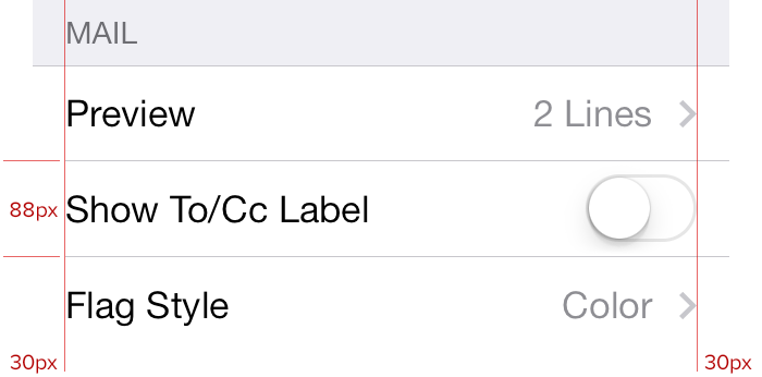
Tables (or lists) are using the full width of the display now and are not any longer surrounded by a container that separates tables from each other. The only visual separation between different table views are headlines which appear on top of the table (as known from previous iOS versions) on top of the main app background texture/color. Items within a table are separated by a simple 1px line, which has a margin of 15pt to the left side of the screens but connects directly with the right side of the screen. Each item has an inner padding of 15pt to both sides.


Apple makes massive usage of icons without a fill color but only outlines with a thickness of 1pt, but "classic" icons with a color fill are still present and widely used in iOS 7. An often used style for active icons in the tab bar are inverted colors – while the inactive icon has often only outlines, the active one get‘s filled with a solid color while some strokes disappear or are inverted.
Helvetica Neue is still the default font in iOS, but normal text is usually displayed in the Light face instead of Regular or Bold now. Text that should appear more prominent is often displayed in Medium face (eg. the title in Navigation Bar). Of course, there are still a lot of alternative font faces available to make use of instead of Helvetica Neue. You can find the whole list here. In general (and likely because of the increased usage of Light font faces) the font size was increased for most design elements. Buttons often appear as simple colored text links. Now, they are no longer surrounded by a shape, which supports its metaphor.
| Label Type | Default Font Size | Default Font Weight |
|---|---|---|
| Navigation Bar Title | 34 px | Medium |
| Regular Buttons | 34 px | Light |
| Table Header | 34 px | Light |
| Table Label | 28 px | Regular |
| Tab Bar Icon Labels | 20 px | Regular |
This article will only provide some basic information to get you started with iOS 7 design. Once you dig in deeper, you might be interested in some more details. These articles and resources should help you out: