As a UX director, I lead the discovery phase of a website redesign—researching and analyzing, discovering insights, developing design ideas, and evaluating concepts. I’m the overall architect of the site's experience, and the facilitator of our creative process. I'm the team member who defends our strategies in front of clients, and the voice of the customer in the eye of the creative storm.
Here's a list of some of the things my team and I do during a typical soup-to-nuts redesign:
- Analyzing sites & generating actionable insights
- Developing a content and UX vision and roadmap
- Aligning stakeholders through UX and content strategy workshops
- Fixing findability: taxonomy, labeling, metadata, navigation, and dynamic publishing
- Wireframing and interactive prototypes
- Usability testing
- Content production & governance planning
- Content & data modeling for PIM & CMS
- Content migration planning
Analyzing sites & generating actionable insights
When working on a new project, the first thing I need to do is figure out what's really wrong with a site and exactly how to fix it. I dive deep into site analytics, SEO, existing user and usabilty testing reports, content audits, and then do a competitive and heuristic site analysis. If I have time and budget, I find running baseline usabiltiy testing on the current site very useful too.
Then I prepare an UX and content strategy insights report and workshop (PDF) and present it to the client, coupled with lots of hands-on workshop activities. Because my insights and recommendations are grounded in analytics, user testing and best practices, clients are typically won over by my conclusions, and in many cases, it's resulted in dramatically expanded projects.
I also sometimes do UX site evaluations for our sales team (PDF)—they're a great tool for demonstrating the value you can bring as an agency.
Developing a content and UX vision & roadmap
Once I've analyzed a site and figured out what's wrong, it's time to work with the client on their site's vision—what content and features should it have in 2 years? 4 years? Then I create a roadmap of what they should work on first, second, third, and so on.
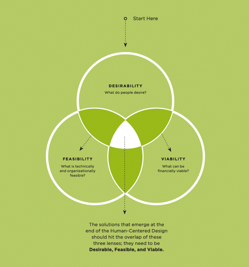
To help me determine which features to include and how to prioritize them, I weigh the overlap between customer desirability, business viabilty and feasibility (see figure below). If a feature doesn't meet all three criteria, I deprioritize it.

– To be worth building, a feature needs to be desired by customers, good for business and technically and resource-feasible (graphic from IDEO).
Fixing findability: taxonomy, labeling, metadata, navigation, and dynamic publishing.
I'm an expert at organizing and labeling sites so customers can find content quickly and easily.

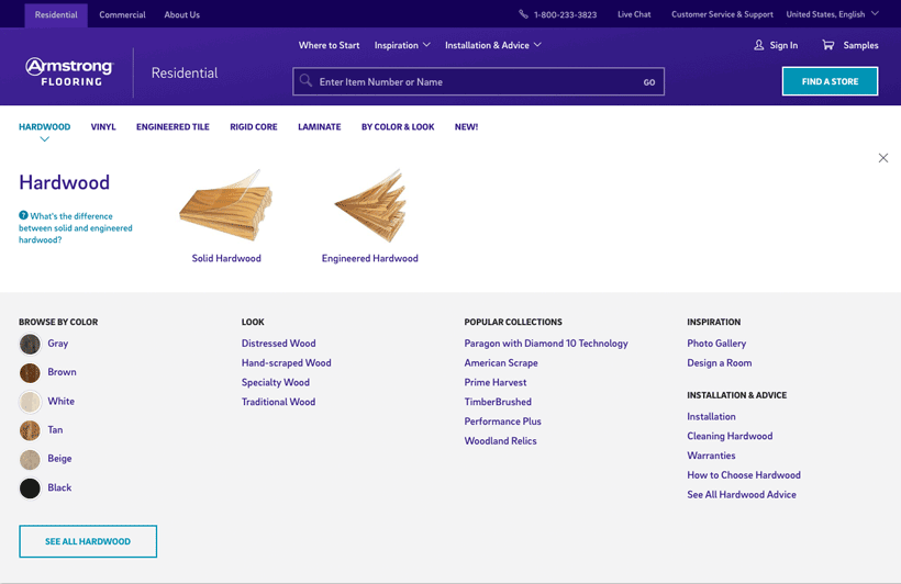
– Global navigation megadrop for the new Armstrong Residential Flooring site. On their old site, Amrstrong had just one category called "hardwood." However, we found that customers didn't understand the differece between Solid vs. Engineered and wanted to browse by color and look.
How your site is organized is one of the most important aspects of site design. If your categories are mislabeled or your content and products are incorrectly categorized, customers will have a hard time finding what they need.
And if they can't find it, they can't buy it!
When creating a new site taxonomy, I first look at:
- Site traffic metrics, especially heat maps of current navigation.
- Google and internal search keywords to determine customer language
- Competitor site categorization
- Usabilty testing (e.g., card sorting and tree testing).
Creating a tagging taxonomy is also a pre-requisite for any content strategy involving dynamic publishing and faceted search—two keys to solving findabilty problems.
Wireframing & Interactive Prototypes
At Shift7 Digitial, we use Axure for wireframing and for creating interactive prototypes.
Recently, our visual design team has converted from Adobe Photoshop to Sketch for high-fidelity design comps. I've experimented using Sketch + InVision for simple clickable wireframes, but I find that Sketch is still too rudimentary as a prototyping tool.

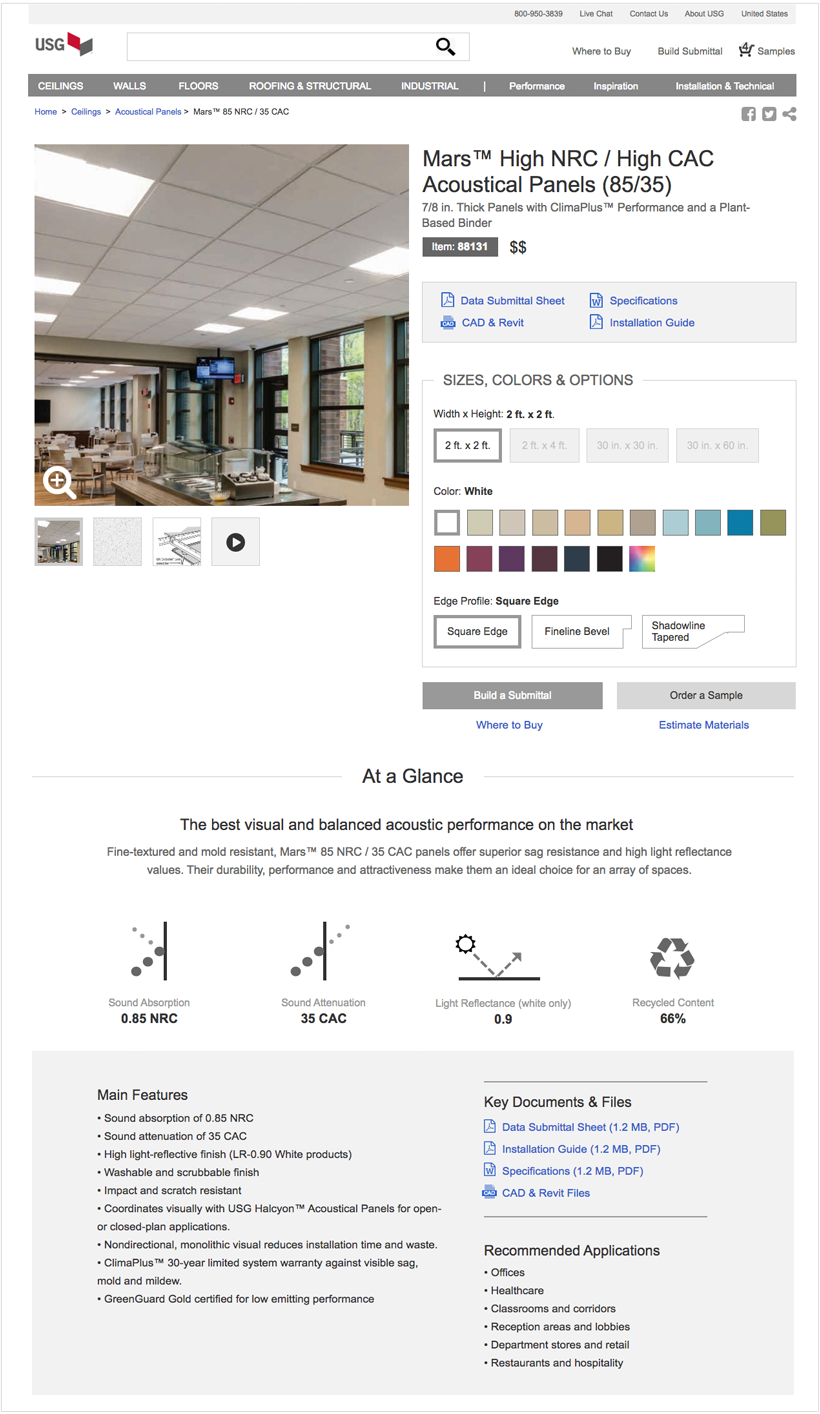
– Wireframe / Interactive prototpye of a product family page with a product variation selector.
Usability Testing
Usabilty testing is absolutely the most important thing you can do during a project to mitigate risk and save time and money. It enables you to catch design problems early before they become big customer and business problems. I like to test before, during and after design!
While moderated (either in-person or remote) usabilty testing is still the gold-standard, it's very labor intensive to set up and analyze. That's why I prefer unmoderated, remote usabilty testing—it's faster, cheaper, and the online software does much of the data crunching for you. All you have to do is prepare the study, email a link to enough customers, and watch the results roll in. And since it's so cheap and fast to run, you can iterate and re-test quickly.
I also like to do "baseline testing" of the current site to identify problems. I usually do this during the discovery phase of a project, before I make recommendations on what needs to be fixed. Then, later in the project, during design, I show cusotmers the new designs, ask them the same set of questions, which enables me to compare apples to apples.
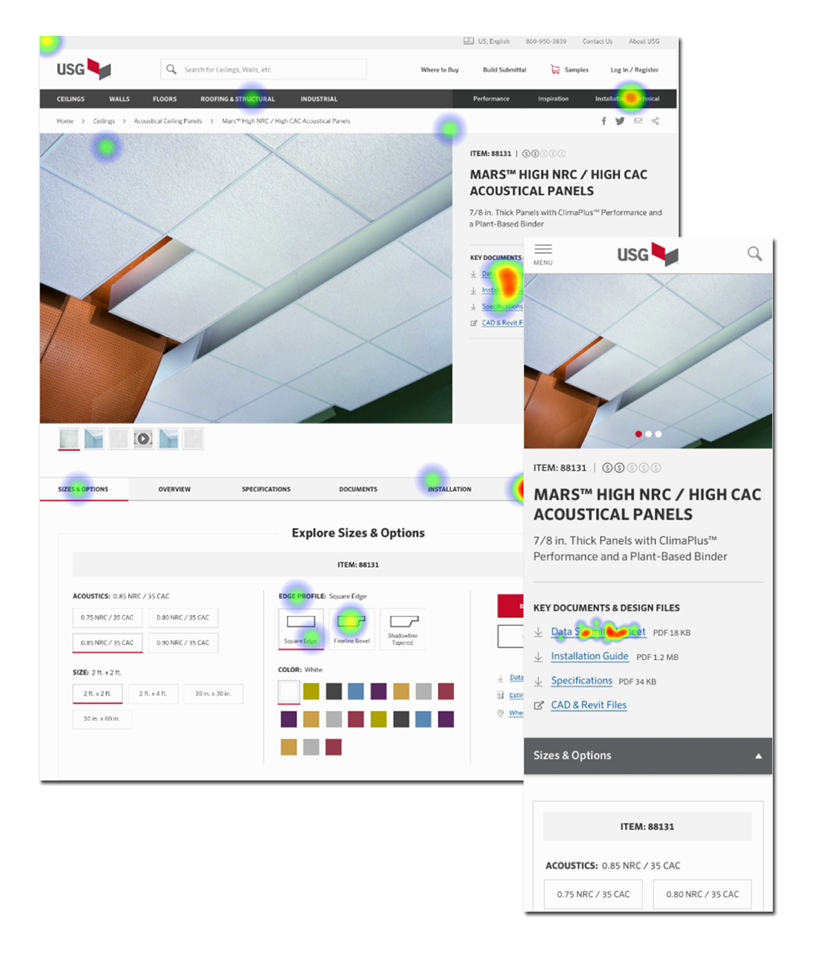
There's a lot of remote, unmoderated usability testing tools, but my favorites are TreeJack, for testing navigation labeling and categories, and either Chalkmark or UsabiltyHub for first click tests with heatmaps.

– Heatmap of where customers clicked on a desktop and mobile designs.