At a Glance
Homeowners found shopping on armstrongflooring.com itimidating. They were confused by unfamiliar flooring categories (what's engineered wood?), and were overwhelmed by too many choices when browsing the site. How do you make complicated products easy to understand and find, so customers feel confident they've made the right decision?
What I did
- UX Analysis
- Content Strategy
- Information Architecture
- Prototyping
- Usabilty Testing
Client's Industry
- Construction
- Architecture
- E-commerce
Type of Project
- Website Redesign
- CMS & PIM
First, figure out what customers really want.
To understand what content and features customers value most (and least) when shopping for floors, I conducted a Top Task Survey with 50 of their customers. I asked each customer to rank their top 5 items from a list of 50. This gave me a great, prioritized list of what customers want on the site.
But what was really interesting was this: when I asked Armstrong stakeholders to rank the same list as if they were customers, they ranked things very differently! For example, customers raked floor durability 1st (most important), but Armstrong stakeholders thought customers would rank durability 18th—that's a very big difference!
The results of this survey were a key insight that we came back to many times throughout the project. It kept us focused on customers and what they want, which is easy to lose sight of when you're knee deep in design and client reviews.
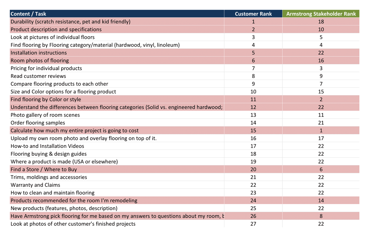
Armstrong Flooring Task Survey: Customers vs. Project Stakeholders
– highlighted rows indicate content and features that customers and stakeholders ranked much differently.
Next, make it easier to find the things customers want most
To identify where customers were getting lost, we tested the site's navigation with customers using Treejack (tree testing software from Optimalsort). The results incidated there were HUGE problems with site navigation—customers were really struggling to find products and other site content.
But findabilty is a big, complicated problem to solve. Where to begin?
I like to start with the basics of information architecture—site structure, labeling, and navigation—because it's the foundation upon which browse and search are built. After pouring over Google analytics, internal search logs, and site metrics, I identified a few major navigational problems:
- Many customers land on the wrong Armstrong flooring website—but don't realize it.
There are 2 Armstrong Flooring webites—a commercial B2B site for architects and contractors, and a B2C website for homeowners. Because both commercial and residential customers search for similar keywords in Google, a good number of commercial customers land on the residential website, and vice versa. Compounding the problem is that neither site was good at telling customers "you are here!" The residential site, for example, didn't explictly say it's "residential" anywhere, so commerical customers who end up there mistakenly probably didn't even realize they're on the wrong site. - Global navigation real estate was not aligned with customer behavior.
The vast majority of customers on the site are looking for flooring (see figure below). Only a small fraction are looking for other information, such as design inspiration. Why then, is the entire Products section only allocated one spot in the global nav, even though it accounts for 8 times as much traffic as the the other 5 sections of the site combined? This is what I call a severly "lopsided" nav.
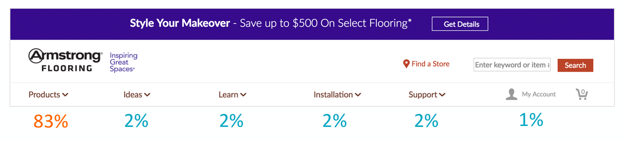
BEFORE: Armstrong's lopsided global navigation.
83% of all customers went to the Products section from the homepage. Customers weren't nearly as interested in the other sections of the site.
Designing better navigation
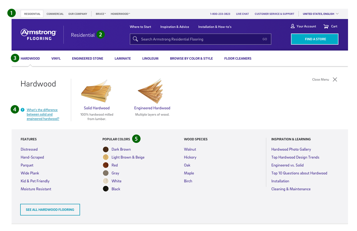
For a manufactuer product catalog site such as Armstrong's, the key to improving navigation is to prioritize product browsing over other site content. This means getting rid of the Products landing page, and listing the 2nd level product categories in the global navigation instead (see #3 in the figure below).
AFTER: Global Navigation
Landing page that is introducing the collaborative workspace concept for teams.
Key navigation improvements (see figure above) included adding:
- Between-site navigation.
This way customers can see which site they are on (residential vs. commercial), and it's much easier to navigate to the correct site if you find yourself on the wrong one. - The word Residential in the logo.
This is what says "you are here" to customers. - Simplified product categories at the top level of the global navigation.
This strategy is great for SEO and dramatically improves browsing, because the keywords customers are looking for are now clealy visible. It's also great for branding, as new customers can see exactly what type of flooring Armstrong sells. I also simplified the labeling and organization of the main categories. For example their old site had 3 different vinyl categories at the same level, none of which customers understood. I combined them all into simply "Vinyl." I also added a new "Browse by Color & Style" section to their site, to give customers another way to shop besides material. - Guidance content in the browse flow.
If customers don't undestand the difference between vinyl sheet, vinyl tile, and luxury vinyl tile, it makes browsing a challenge. For this reason, we embedded key guidance content into the browse experience. - Browse by style, color, wood species, and so on.
Previously, customers could only browse by flooring material. Now customers can also browse by color or style, or type of wood.
Better browsing
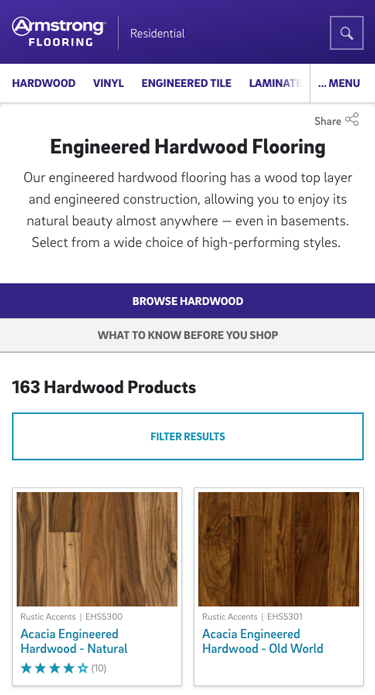
Product category pages are arguably the most important pages in any online catalog. It's where customers scan through their product options and then either find what they're looking for... or don't. If customers are having problems finding products, odds are you'll find the root cause on the category page.
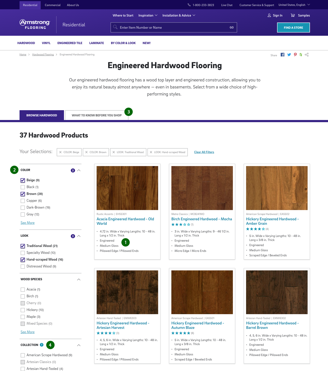
Category Faceted Browse Page
Better faceting, better labels and added specifications so customers can differentiate one product from another. Also added "what to know before you shop" guidance content.
Key usability improvements to Armstrong's browse pages:
- Added key differentiating specifications to the product result.
Armstrong's old site had great product photography, but because so many of the important differences between products are not visible in a photo (e.g., thickness, level of gloss, edge styles, wear coatings, etc.), customers on browse pages just saw a sea of almost identical hardwood floors—and got stuck. What customers needed was more information to help them distinguish one brown hickory hardwood floor from the 10 others that look just like it. I worked with - Improved labeling, organization and UI of faceted flitering.
- Converted facets from links to checkboxes. Link-style facets are a usability issue because they prevent customers from selecting more than one value within a single group (e.g., customers couldn't select both brown and gray flooring at the same time). Link facets also make it more challenging to clear filters (customers prefer to uncheck checkboxes.)
- Labeled and organized facets based on customer, not company, preferences. We listed facet groups from most to least popular based on metrics.
- Added guidance content for customers who need more help shopping.
- Added tool tips to help customers understand confusing labels.
Sometimes you can't avoid labels that are confusing (e.g., what's a beveled vs. a square edge?). In these cases, we added tool tip-like definitions.
Make it easier to select variations on the product page
On their old product pages, Armstrong grouped floors together by color, but not by any other variations.
This was a BIG product discovery issue, because once on a product page, customers had no way of knowing if a floor they liked came in different lengths, widths, thicknesses, gloss levels, or edge styles.
Our solution was twofold:
- Redefine the rules governing product familes, so we group floors together by all their variations, not just color.
- Design an easy-to-use UI for customers to select viable combiations of variations within a family.
#1 doesn't sound too difficult, but figuring out how many SKUs to group together into a product family is tricky. Group too many together and selecting options on the product family page becomes overly complicated. Group too few together, and customers won't understand all their options.
And then there's the key question: what's a variation vs. a difference that makes something into a completely new product? For example, if two hardwood floors look identical (same color, same style, same width), but one is made of oak and another hickory—are these two variations of the same floor, or two completely different products? You need to figure out these kinds of rules for each each product category, which is no small task.
After all that, designing the Colors & Options widget for customers to select variations was the easy part!
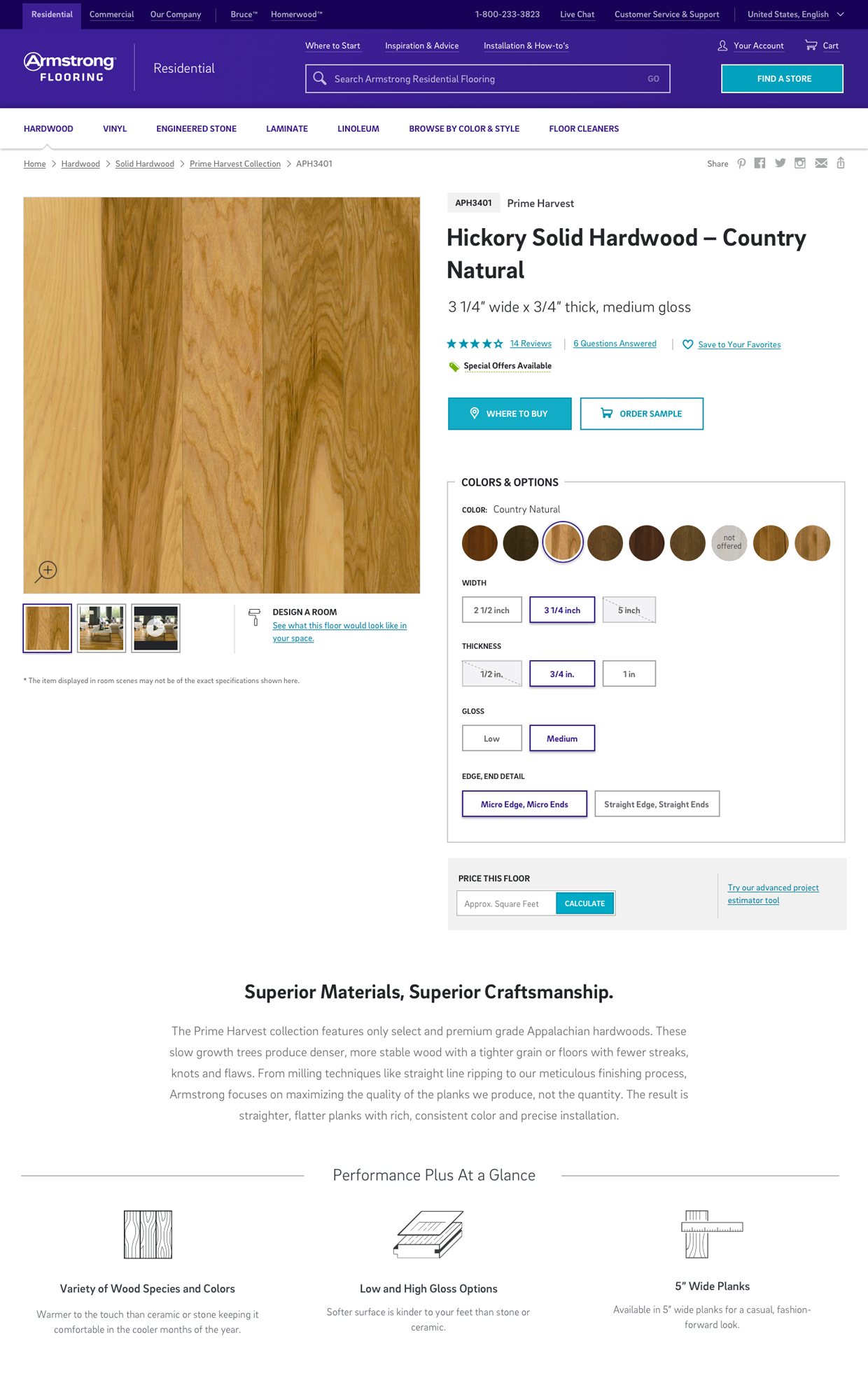
Product Page with a Colors & Options widget to select
With the new Colors & Options widget, customers can now easily see if a floor they like comes in different widths, thicknesses, gloss levels, or other variations.
And don't forget Mobile!
All our designs are responsive, and while i'm not going to go into detail here, we have to make many decisions about how elements will stack, appear (or disappear) and behave differently in mobile and tablet than they do in desktop. Our goal is optimize our designs for each device.

Homepage with Global Navigation
Navigation is too important to hide under a hamburger menu! Instead, we show the product categories in mobile.
Hardwood menu
The full-width menu makes it easier to browse the category.
Product Category
To simplify the product result, the client opted to hide the differenating specifications. This will likely make it more difficult for mobile customers to compare products.
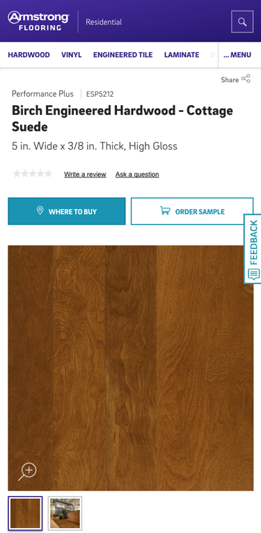
Product Detail Page
Where to Buy and Order Samples are the 2 most important calls to action, so we show them at the top of the page..